
We’ve all seen those signs on the highway where you think, “Wait, what did that say?” Usually, by the time you’ve squinted hard enough to make out the font, you’re already a mile down the road.
At Sir Graphic, we spend a lot of time thinking about how brands move through the world—literally. Whether it’s a commercial vehicle wrap on a truck or a logo on a tiny business card, your branding has a job to do, and it needs to do it fast. Let’s make sure your business isn’t getting left in the rearview mirror.
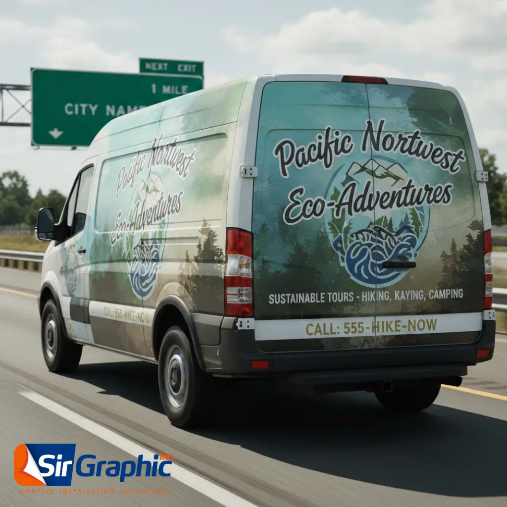
What is the Billboard Test?
The “Billboard Test” is a simple gut check for your brand identity: Can someone understand who you are and what you do while driving 60 mph?
In the world of fleet graphics and outdoor signage, visibility is everything. But this isn’t just for highway drivers. If your logo is too cluttered to be read on a moving van, it’s probably going to struggle as a small profile picture on social media or a stamp on a packing slip.
1. Simplicity is Your Best Friend
We get it—you want your logo to tell your whole story. But in professional logo design, a logo isn’t a book; it’s a handshake. When a design is too busy, the human eye doesn’t know where to land.
The most iconic brands (think Nike or FedEx) pass the billboard test because they stripped away the “fluff.” If your logo has thin lines, three different fonts, and five shades of color, it will turn into a blurry blob at a distance.
2. High Contrast: The Secret to Being Seen
At Sir Graphic, we’re big fans of “Safety Meets Style.” We see it every day with emergency vehicle graphics—contrast saves lives. For your business, contrast saves sales.
If you have dark grey text on a black background, it might look “sleek” on a computer, but under a bright sun or a rainy Northwest sky, it disappears. Bold, high-contrast colors ensure that your name pops against any background.
3. Why “Less is Almost Always More”
When designing for fleet branding, every extra detail is a distraction. If you can remove an element from your logo without losing the meaning, remove it.
- Avoid “Over-Scripting”: Fancy cursive is for wedding invites, not for commercial van wraps. Choose bold, sans-serif fonts for maximum legibility.
- Check Your Scale: Shrink your logo to the size of a postage stamp. If you can’t read it, it’s time to simplify.
4. Consistency Across Your Fleet
Whether you have one service van or a fleet of fifty, your branding needs to be uniform. Consistent use of colors and logo placement builds “brand echoes”—the more people see your consistent design around town, the more they trust your expertise.
5. Professional, UASG Certified Installation
Even the best design fails if it’s installed poorly. At Sir Graphic, we believe your visuals should work as hard as you do. That’s why we partner with certified professional graphics installers through the United Application Standards Group (UASG).
A certified installation ensures your wraps are applied with precision, preventing peeling and fading, and ensuring your brand looks professional for years to come.
Is your logo ready for the road?
If you aren’t sure if your design passes the test, try this: print it out, tape it to a wall, and walk twenty feet back. If you have to squint, it’s time for an upgrade.
Ready to elevate your brand with high-impact fleet wraps? [Contact Sir Graphic today] to speak with our design team about turning your “blurry” brand into a “bold” powerhouse.
